Friday 23 March 2012

Evaluation

In what ways does your media product use, develop or challenge forms and conventions of real media products?

Before creating my magazine, I analysed a selection of music magazine front covers, contents pages and double page spreads to gather a variety of conventions that I thought would enable me to create successful magazine pages that would appeal to my target audience. In my magazine I have included most typical conventions of magazines, for example the interesting masthead that would create a new band or artist’s identity for my magazine. This is placed at the top and centered, as I discovered that this is a common feature of a music magazine. I found all of the mastheads on the front cover were at the top of the front cover or placed top left of the front cover. I also positioned the main feature story at the bottom of my front cover in a much larger font than the other cover lines, and where placing the main feature story at the bottom of the cover is not a common feature of a lot of magazines I did find that some magazines do use this feature and for my own magazine I found that it was what worked most effective for my music magazine. I have tried to make my magazine look as much like magazine you would see on the shelf today. As well as looking at the layout if the magazine and the use of text, I also looked at the use of image and colours. In each of the front covers, the colour scheme was taken from the image and in some way, for example the spin front cover colour scheme was taken from the facial features that the artists had, such as the eye colour. To create this effect for my own images I have taken black from the clothing and hair of the artists, as well as the blue from the artists eyes. I also used the colour white even thought this colour does not feature on the image that I have used for my front cover. However I found that this was a colour that worked well with the black and blue. As grey was used in the background of the image for my front cover, I decide that I would add this colour to my colour scheme and continue you it throughout my contents page and double page spread images as it worked well with the rest of my colour scheme. By using colours from my only my images I was able to continue the colour scheme throughout my magazine, linking each section together and making it professional and artistically rewarding. I tried to make my images look as professional as possible editing the contrast and brightness on publisher as well as cropping and editing anything else when I needed too. I have not included any competition advertisement on the front cover as I feel that the interviews alone and image would interest my intended audience, I think that advertising ‘free’ things and competitions is to cliché for my sort of magazine and would actually put the audience off buying it if they saw it on the front cover. I have also included certain conventions that all magazine have, making them look realistic ad professional, such as a bar code, a price, a date and an issue number. Although these conventions of the magazine are not as bold and noticeable, as they are always featured on a music magazine, they do put the finishing touch on the magazine making it appear realistic. Therefore this was an essential convention to be added to my magazine.

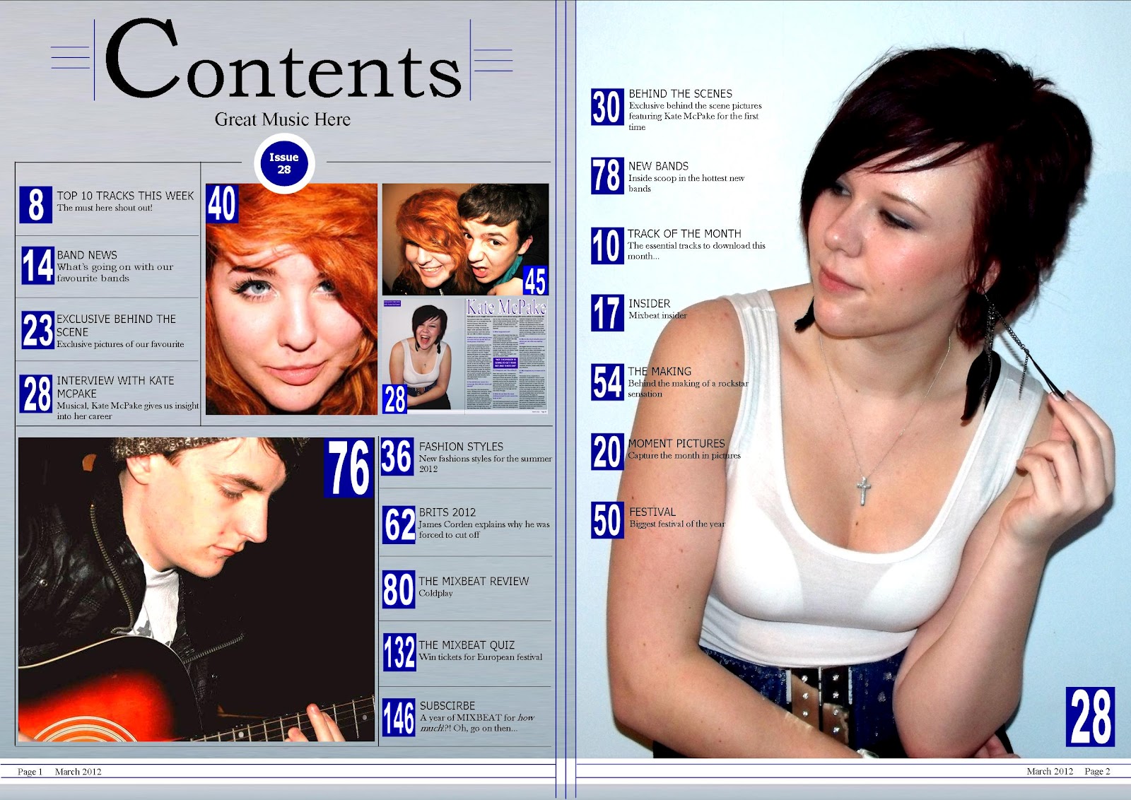
After anaylising three contents pages it was clear to see a number of typical conventions that the magazines used. For example all three contents pages that I annotated divided the page up into thirds. This was a convention that I used for my own contents page and found that it was particularly helpful for creating a layout that was aesthetically pleasing and professional. Another feature that I noticed was that there are different fonts and sizes used on the contents page. This helps to make the different sections or more important text stand out on the page. I used these conventions to create a contents page that was well laid out – organised and easy for my target audience to follow. However trying to fit everything on one single page for my contents page proofed difficult and did not as look as professional as I thought I could make it. Therefore I used a double page for my contents page. Using the first page for the majority of my information and including four images – one of which was a picture of my article, which I found was a convention of ‘Q Magazine’. I then used the second page for a larger image that took up the whole page. The image was of my artist featured in my article. This image then included more information going down the left hand side of the image. Although the content pages that I analyised used only a single page, I found that this is still a feature used in many magazines, although quite unconventional, however, it was the way that was the most rewarding for my magazine, giving it a professional look. When comparing my own contents page to other existing content pages I think that it easy to see which conventions I have applied to my own magazine, even though I have used quite an unconventional layout with a double page contents page.

Similarly to my front cover and contents page, I analyised two double page spreads and gathered conventions to apply to my own double page spread. I decided to create quite a conventional layout for my article. I made the only image included in my double page spread take up the whole of the left hand page which allowed my target audience to see the featured artist whilst also setting the mood of my article. I wanted to create quite a fun, laid back feminine tone. One particular convention that I noticed ran through both double page spreads that I annotated was that the article its self was split up into quarters. I discovered by taking a further look into layouts that the more conventional layout of articles was in thirds. So, although the articles that I anaylised used quarters, for my own article I took a more conventional look and split my article into thirds. I found that this gave my article more of a professional look and using quarters could have been a risky root to take my article down as it is more difficult to follow. An important convention that I picked up on was the use of quotes. I found that this feature added the finishing touch to an article and therefore used this feature on my own article – giving it the finishing touch and making it more professional.


How does your media product represent particular social groups?

When producing my magazine pages I designed and created it around a particular target audience which was people interested in rock and pop genre of music, aimed at the social group of people aged from 16 - 21 year olds, both male and females. My magazine divides social groups through gender and age. For example the images that I have used throughout the product are of the same age as my target audience. If I used an older person on my front cover I may not have attracted the audience I was aiming for or represented their social group. I have aimed my product at both makes and females as I wanted to attract a wider target audience. Throughout the making of my production I tried to keep my target audience in mind, however looking back over my magazine now I think I may have made it appeal to the more feminine audience more than the masculine side of my audience. However, where I have used images of females throughout my magazine and very few males, the images of the females I have used are of strong females. Therefore using these images of strong female i feel that I was still able to attract both a masculine and feminine audience. When analyzing my magazine pages, I think that the main social group that I have represented is females. The representation I chose to send to my readers of females was strong and positive. I think this representation was presented particularly well with my front cover my double page spread. Stereotypes for teenagers are usually loud, ignorant, arrogant, bad mannered, scruffy ect. However the artists used in my magazine challenge these views. The artist I have used on my front cover I believe presents a strong, ambitious and respectful female. From the position  and body language of the artist you can see that she is a strong headed and fun individual, and stereotypically for an individual of this age this could be taken as the artist being loud and bad mannered. However, in the image you can see that the artist is wearing a bead necklace which suggests more of a polite and well-mannered individual, as well as being of a high class. I that the costume of the artist on my front cover is well put together. The black vest top gives a casual look, aimed more towards lower class; however the bead necklace adds a touch of elegance of higher class. I feel that this therefore helps to attract my target age group from all social classes. I don’t think that I have included any other social groups; however at the same time I don’t think that I have excluded any social groups with the way that it has been laid out or by the way any of the text has been wrote. In my article I asked questions that would not sway the artist answers to discriminate or exclude any social groups.


What kind of media institution might distribute your media product and why?

Every music magazine is distributed by a specific media institution. When I finished analysing my finished magazine and decided on the genre and target audience of my magazine, I then decided on a media institute that I thought would help me fulfill these points and my magazine to be as successful as possible. I decided to go with Bauer Media as it sounds the most promising media institution to distribute my magazine. It currently publishes other big music magazines such as Kerrang! and Q Magazine, as well as offering over 300 magazines to 15 countries around the world. It also distributes radio stations and online magazines which mean they get my magazine to a great level and even as good as Kerrang! and Q Magazine. Bauer employs around 6,4000 people and has a 2008 turnover of 2.08 billion Euros. Bauer Media reaches over nineteen million UK adults across multiple media channels. They have more than eighty influential media brands spanning a side range of interests, including; heat, GRAZIA, Closer, MCN, FHM, Parkers, MATCH, Magic 105.4, Kiss 100, Kerrang and 4Music. This media institution is built on millions of personal relationships with engaged readers and listeners. They connect audiences with compelling contents, whenever, wherever, and however they want. Their unique insight allows them to work closely with their customers to develop innovative solutions that create a difference to their business. Bauer Media is a multi-platform UK-based media Group consisting of many companies collected around two main divisions - Magazines and Radio - widely recognised and rewarded as being industry innovators. This institution is a sister company of H Bauer Publishing, publisher of the UK's biggest TV listings, Take a Break and Bella. As Bauer Media is responsible for a number of successful magazines with a similar target audience to my own magazine, I thought that this institute would benefit my magazine especially with their promise to ‘Connect audiences with compelling content’ I think that this particular point is crucial to create successful media products.


Who would be your audience for your media product?

Before starting the design and production of my magazine pages I had decided on a target audience that I then kept in mind throughout the development of my magazine and made decisions based on this target audience. The target audience for my magazine is people aged 16-21, both male and female. I have chosen this age group to focus on because I think that people this age are more likely to listen to the music and bands that I am writing about. This is because I fit into this category myself. My music magazine is more aimed at females, as the way I write and present is in a more feminine way, as a posed to a magazine like ’Kerrang!’ where the writing is aimed at males more than females. Most bands in this genre are all males, so I think that writing in a different style will give a better aspect of females listening to music. To make my magazine appeal to my target audience I have used a selection of techniques. On my front cover I have included a small selection of cover lines that would appeal to my target audience, such as including artists from my chosen genres. I also included a cover line about the 2012 awards as this is something that my chosen age group would watch and find interesting. In my double page spread, I used a conventional layout as it makes it easy for the reader to follow as they will be familiar with this particular layout. Although I think that my magazine appeals to my target audience, with a conventional layout of the pages and features artists that they will find appealing, I think that my overall finish appearance is more appealing to females than it is to males. This is because of my use of features images, as there is only one image featured in my magazine that is of a male, and therefore is the only real feature that could possibly attract a more masculine audience, as the rest of my images are of females and has quite a feminine touch which attracts a more feminine audience. However when creating a house style, I carried my colour scheme through the rest of my magazine, and where I mainly used a female model for the majority of my images they did not where stereotypical feminine clothing throughout all the photographs. Therefore as this is only one issue of the magazine, a male audience may still be inclined to buy the magazine. Therefore hopefully people who would be familiar with my magazine would not be put off.


How did you attract/address your audience?

I attracted my target audience by having an interesting front cover with a brightly coloured masthead; this gives the magazine a brand identity. To create front cover/contents page/double page spread that my audience would find interesting, I firstly had to conduct initial research into who I could aim my magazine at so I handed out questionnaires to people from my target audience to find out the key information about them and whether the magazine would appeal to them. I then put this information into graphs so that I could see my data clearly. The cover lines on my front cover are features that would be interesting to the target audience. For example bands featured and exclusive interviews. The colour pallet I have used is mainly black, grey, blue and white; this would attract more people to my magazine. The blue and white cover lines connect with the masthead. The way the magazine talks to the audience is in a not too chatty way as I wanted to keep it informational, grown up, fresh and classy.


What have you learnt about technologies from the process of constructing this product?

Previous to this project I have had a year of experience taking and editing photographs so some of the programmes I used in the production of my magazine pages were familiar to me however I did have the opportunity to get to know certain programmes and investigate their tools. During my photo shoot I used basic equipment such as a camera and lights to create a better quality of photos. After my photo shoot I was able to use different programmes to create different effects. I improved my digital camera skills when taking my photos and setting up my photo shoot. I used light walls that would keep with my house style and lighting to create a shadow. I also changed the brightness of the flash on different photos. I edited my photographs using Photoshop and Fireworks and manipulated them to work well with my magazine layouts. Although I could edit my photographs easily with Photoshop, as it was a programme that I was familiar with, I wasn’t as familiar with Fireworks so I encountered a few problems whilst trying to change the brightness and contrast of the background of the photographs, however with a bit of practice this was easily overcame and ended with a good quality image. For the production of my magazine itself I used Microsoft Publisher and with previous knowledge of using this programme before I was able to put my knowledge of the programme into practice. Although I had not created any media products using this programme before the knowledge that I was effective for creating a successful and professional looking magazine and as I went along I learnt more about various tools to use during my production process particularly with the font and creating a shadow effect. Throughout the process of making this magazine I have learnt more about how to use programs such as Fireworks and how to create a blog.


Looking back at your preliminary task, what do you feel you have learnt in the progression from it to full product?

Looking back at my student magazine for my preliminary task and comparing it with my finished product of my music magazine it’s easy to see the dramatic difference between the two. Compared to my finished music magazine, my preliminary task looks poor, however it has helped we learn how to make my magazine look more professional by taking better photos and planning my photo shoot. Since creating the student magazine I think that I have gained more knowledge of what makes a good and successful magazine. As well as extending my knowledge of programmes such as Fireworks and extending my ability to create media products, I have learnt the knowledge I need to make my magazine successful, such as a specific target group. I have also learnt that time keeping and planning is important to keep up to date and on top of creating my media products. The preliminary task helped me to figure out how to get the best out of programmers like Photoshop and let me figure out more about my blog. I have learnt that editing my photos gives my magazine a professional touch to it. Making sure that I took in my audience feedback when creating my magazine I think I have managed to create a magazine that would appeal to my target audience. I feel since I didn’t carry out much research during my preliminary task I wasn’t able to get the best understand possible of my target audience and what they wanted. In comparison when creating the production of my music magazine I was able to carry out both primary and secondary research in order to gain a better understanding of what my audience wanted. By carrying out this research with questionnaires and existing products, I was able to produce my magazine so that it was specifically aimed at my target audience; because of this I was able to use my knowledge of target audience to create my magazine including my fonts, images, colour scheme, layout and colour scheme. I learnt that the front cover needs to have a carefully structured layout in order to not make it too busy nor have a lot more or less content then necessary. I have also learnt how to set up a better contents page. When it came to making my music magazine content page I realised that I needed more columns, using thirds as it looks much better and more professional, as well as sections like a feature and regular section. The way I set up my contents page for my preliminary task makes it seem like there isn’t much content in the magazine which will put the audience off. I learnt front this by adding more detail to my contents page for my music magazine and laying it out in a way that will attract my audience. The front cover is more aesthetic compared to the front cover for my preliminary task. I found that this was important how I set up my front cover when it came to creating my music magazine in order to make it successful. I managed to create a house style and continue that from the cover onto the contents and then finally to my double page spread. I chose the colours blue, white, black and grey as the house style. I chose two simple colours for the title of my front cover and article, blue and white but different fonts to have as the main fonts for the magazine and used the same effects on the text but I changed the colours around depending on what background they were placed on so they stood out the most. Learning all of this I took this and made use of it in my music magazine.

Double Page Spread of Music Magazine

This is my double page spread for my music magazine. For my double page spread I used one large image of who my interview is about. Again I edited this image adjusting the brightness, contrast, cropping and removing the background. I then created a background for my image (keeping in mind my house style) and this background then continues across my article.

Contents Page for Music Magazine


This is my contents page for my music magazine. On my contents page I have used a range of images that would be included in my magazine, I have edited them again adjusting the brightness and contrast as well as cropping the images until they were at their best and most professional look. I have used found images on my contents page using different people, different shot angles and different sizes, in order to get the most out of them as possible without them looking tacky.

Front Cover for Music Magazine

This is my front cover for my music magazine. For my image on my front cover I have edited it on publisher adjusting the brightness and contrast till it worked and looked as professional as I could make it.

Progress for Double Page Spread


This is the progress of my double page spread for my music magazine, starting from top left to top right, then bottom left to bottom right. Collecting feedback at different stages throughout the production of my double page spread helped me to make appropriate changes to my double page spread. These changes were made to make my double page spread as appealing as I can make it to my target audience, as well as making it as successful as possible.

This is what my double page spread looks like; however after final feedback I am going to make a few little changes to it, in order to make as effective as I can. For example, I will change the colour of the white sub-heading. This is beacsue from feedback the colour of the sub-heading is something that does not work quiet as effective as it could. I think that this is an important thing to take note of in order to make my double page spread work as effective as possible.

Progress for Contents Page

This is the progress of my contents page for my music magazine, starting from top left to top right, then bottom left to bottom right. Collecting feedback at different stages throughout the production of my contents page helped me to make appropriate changes to my contents. These changes were made to make my contents page as appealing as I can make it to my target audience, as well as making it as successful as possible.

Progress for Front Cover


This is the progress of my front cover for my music magazine, starting from top left to top right, then bottom left to bottom right. Collecting feedback at different stages throughout the production of my front cover helped me to make appropriate changes to my front cover. These changes were made to make my font cover as appealing as I can make it to my target audience, as well as making it as successful as possible.


This is what my final front cover looks like; however after final feedback I am going to make a few little changes to it, in order to make as effective as I can. For example, where it says 'women on top', on main cover line, I am going to raise this particular bit of font up to make it closer to the middle of the cover line. This is because as the minute it looks seperate to the rest of the cover line. I think that this is an important thing to alter in order to make it look as if it goes together as it should.

Wednesday 21 March 2012

Photographs for Double Page Spread


This is the final finished photograph that I am using on my double page spread. I have edited this image by adjusting the brightness and contrast to make it as successful as possible on my article. I have also cropped out bits of background that are not necassery in order to fill up the space as much as I can with the main image its self without loosing any important aspects of the image itself. I think that it is a catch image that will catch my audience eye and draw their attention into the article. The image suggests that the article is about a fun bubbly artists, which I think is also represented within my article and therefore the two represent each other well and go hand in hand with one another.

Photographs for Contents Page


This is an photograph of an extreme close up that I have choosing to use for one of my smaller images that fill feature on my contents page. I think that this photograph will be a successful image on my contents page. This is because I think the style of the image represents my music magazine well. The colours in the photograph are kept basic.


This is the main final finished photograph of an image that I am using on my contents page. For this image I have used a close up shot. I have edited this image by adjusting the brightness and contrast to make it as successful as possible on my contents page. I have also cropped out bits that are not necassery in order to fill up the space as much as I can with the main image its self without loosing any important aspects of the image itself. I think that it is a catch image that will catch my audience eye and draw their attention into wanting to know what is featured in the magazine.

This is an photograph of an extreme close up that I have choosing to use for one of my smaller images that fill feature on my contents page. I think that this photograph will be a successful image on my contents page. This is because I think the style of the image represents my music magazine well. The colours in the photograph are kept basic, however the colour of the hair in this image works really well will the colour on the guitar of the previous image. Therefore I will put these two images close together so that the colours can run nicely from one to the other. I think that these are two images that will go hand in hand with each other very nicely. they keep with the house style of my music magazine.


This is the main final finished photograph of an image that I am using on my contents page. For this image I have used an extreme close up shot. I have edited this image by adjusting the brightness and contrast to make it as successful as possible on my contents page. I have also cropped out bits of background that are not necassery in order to fill up the space as much as I can with the main image its self without loosing any important aspects of the image itself. I think that it is a catch image that will catch my audience eye and draw their attention into wanting to know what is featured in the magazine.

I have used a mid shot for this image. I think that this photograph is the one that will be the most successful as the main and largest image on my contents page. This is because I think the style of the image represents my music magazine well. The colours in the photograph are kept basic, however they keep with the house style of my music magazine.


This is the main final finished photograph of the main image that I am using on my contents page. It is a mid shot of the artist that will be featured in my article, leaning against a wall. I have edited this image by adjusting the brightness and contrast to make it as successful as possible on my contents page. I have also cropped out bits of background that are not necassery in order to fill up the space as much as I can with the main image its self without loosing any important aspects of the image itself. I think that it is a catch image that will catch my audience eye and draw their attention into wanting to know what is featured in the magazine.

Photographs for Front Cover

This was one of the first photographs that I took myself  for my front cover. It is an unedited version of the image. I thought that this image could work on my front cover, however after trying it out I decided that it would not make my front cover as successful as I think I could make it. So, after trying this image out and choosing against it I took some more photographs and got an image that would work excellently as the main image for my front cover. Although it is not a photograph of the main person featured in my music magazine, that being the person my article is about. Therefore too come around this problem I will change the main cover line on my front cover to be about the person I am using on my front cover.

After choosing against using my original photographs for my front cover, I took more photographs a found that this image (to the right) is the one I will use for my front cover. This is because I think the style of the image represents my music magazine well. The colours in the photograph are kept basic, however they keep with the house style of my music magazine. This is not the person that I have used for my double page spread, however, I did not feel that it was necassary to have the same person on my front cover as I have written about for my article. This is because from my research I found that there was a number of articles and interviews in music magazine about a variety of different artists and bands, who can not all be on the front cover. Therefore because having a different artist on my front cover to the artist I have interviewed for my article is not a problem. As this suggests that there are more articles in the music magazine and shows that this is thought about. The artist for my article will still be mentioned on my front cover as well as this new artits that I have introduced to my magazine.


This is the final finished photograph that I am using on my front cover. I have edited this image by adjusting the brightness and contrast to make it as successful as possible on my front cover. I have also cropped a tiny bit at the bottom to make it fit onto my front cover nicely without loosing any important aspects of the image itself. Its a catch image that will catch my audience eye and draw their attention into it.

Friday 10 February 2012

Screanshot of email sent for photo shoot

This is an emial that I have sent to a friend who I am going to use to take photographs of, for my images that I will use for my front cover, contents page and double page spread. This email informs, where to meet, what it is for, and what colours to wear. The colours are mentioned as it is important that the colours that they wear fit the housestyle of my magazine.

Basic computer version of double page spread

This is a basic computer version design idea of what my double page spread for my music magazine will be like. This is my first design idea. This computer version design for my double page spread is a very basic idea. It works well in showing the basic idea of the layout of this design idea. However, it is very basic and I don't this that it is effective as it good be. Nevertheless you can see where this design is heading and starts to give you an idea and view of where this design is heading and will turn out.


This is a second computer version design idea of what my double page spread for my music magazine will be like. This one is different to the one above as this contains an extra feature feature box. Again this computer version design for my double page spread is a very basic idea. It works well in showing the basic idea of the layout of this design idea. However, it is very basic and I don't this that it is effective as it good be. Nevertheless you can see where this design is heading and starts to give you an idea and view of where this design is heading and will turn out.

This images used in for these designs are not the exact photographs that will be used for my final double page spread, as these are not my own photographs.

Basic computer version of contents page


This is a basic computer version design idea of what my contents page for my music magazine will be like. This is my first design idea.This computer version design for my contents page is a very basic idea. It works well in showing the basic idea of the layout of this design idea. However, it is very basic and I don't this that it is effective as it good be. Nevertheless you can see where this design is heading and starts to give you an idea and view of where this design is heading and will turn out.


This is a second basic computer version design idea of what my contents page for my music magazine willl be like. I think that this computer version design for my contents page is a very basic idea. It works well in showing the basic idea of the layout of this design idea. However, it is very basic and I don't this that it is effective as it good be. Nevertheless you can see where this design is heading and starts to give you an idea and view of where this design is heading and will turn out.


The images used for these two design ideas are not the exact photographs that i will be useing for my final contents page.


Basic computer version of front cover

This is a basic computer version design idea of what my front cover for my music magazine will be like. This is my first computer version idea.I think that this computer version design for my front cover is a very basic idea. It works well in showing the basic idea of the layout of this design idea. However, it is very basic and I don't this that it is effective as it good be. Nevertheless you can see where this design is heading and starts to give you an idea and view of where this design is heading and will turn out.


This is a second basic computer version design idea of what my front cover for my music magazine will be like. Again I think that this computer version design for my front cover is a very basic idea. It works well in showing the basic idea of the layout of this design idea. However, it is very basic and I don't this that it is effective as it good be. Nevertheless you can see where this design is heading and starts to give you an idea and view of where this design is heading and will turn out.


The images used for these desing ideas are not the exact photographs that will be used for my final front cover.

Handrawn sketches of double page spread

This is my first hand drawn sketch idea of the layout of my double page spread. Including sketches of photograph ideas to be included in the double page spread of my music magazine. I think that this is a good first sketch idea for my double page spread. I think that it starts to give me a good idea of were the layout and the contents of my double page spread is heading. I have took these ideas from present music magazines that I have been researching. For this particular design I have took the idea of an extra features column being added to the left of the article. I think that its good for a quick sketch idea however layout could of possible been thought about better to make it more effective for giving a good strong idea of the outcome of my final finished front cover.


This is my second hand drawn sketch idea of the layout of my double page spread. Including sketches of photograph ideas to be included in the double page spread of my music magazine. I think that this is again a good sketch idea for my double page spread. I think that it starts to give me a good idea of were the layout and the contents of my front page is heading. 

Thursday 9 February 2012

Hand drawn sketches of contents page

This is my first hand drawn sketch idea of the layout of my front cover. Including sketches of photograph ideas to be included on the front cover of my music magazine. I think that this is a good first sketch idea for my contents page. I think that it starts to give me a good idea of were the layout and the contents of contents page is heading. I think that its good for a quick sketch idea however layout could of possible been thought about better to make it more effective for giving a good strong idea of the outcome of my final finished contents page.


This is my second hand drawn sketch idea of the layout of my contents page. Including sketches of photograph ideas to be included on the contents page of music magazine. I think that this is again a good sketch idea for my contents page. The photographs to be used are different to the prefers which is good in giving a second possible view of how my contents page could turn out. I think that again it starts to give me a good idea of were the layout and the contents of my contents page is heading. 
.

This is my third hand drawn sketch idea of what my contents page will possibly be like. Including sketches of photograph ideas to be included on my double page spread of my music magazine. This third idea is different to the previous two as it is over a double page, where as the previous two were only a single page for the contents. This is the idea that I am going to go with because taking up a double page for a contents page will allow me more space for texts and images. Therefore it should not look as crowded as more space will be allowed.


I think that these sketch ideas for my contents page are good in showing three different layouts of how my final finished contents page could turn out. I have kept my sketches basic however I think that they work effectively in showing design ideas.

Hand drawn sketches of covers

This is a hand drawn sketch idea of what the layout of my front cover will be like. Including sketches of photographs to be included on my front cover. I think that this is a good first sketch idea for my front cover. I think that it starts to give me a good idea of were the layout and the contents of my front page is heading. I think that its good for a quick sketch idea however layout could of possible been thought about better to make it more effective for giving a good strong idea of the outcome of my final finished front cover.


This is a second hand drawn sketch idea of what the layout of my front cover will be like. Including sketches of photographs to be included on my front cover.  I think that this is again a good sketch idea for my front cover. The photograph to be used is completely different to the prefers which is good in giving a second possible view of how my front cover could turn out. I think that again it starts to give me a good idea of were the layout and the contents of my front page is heading. I think that its good for a quick sketch idea however layout could be though about more as now looking at it finished looks a bit bare.

Sketches ideas for photographs/coverlines/inside infomation

These are sketches of photograph ideas that i intend to use for my front cover. Above these images are cover line ideas that I may use on my front cover. I think that these sketches are a good sample of different photograph ideas I could use for my front covers. I also think that the cover lines above these are a good samples for ideas to use, as well expanding on. I can now use these sketches and cover lines as a starting board to create my front cover and expand on them to make it successful.  


These are sketches of photograph ideas that i intend to use for my contents page. I intend to use 2-4 of these images. Above these images are ideas for what text will be included for my contents page. I think that these sketches are a good sample of different photograph ideas I could use for my contents page. I also think that the text to be included on my contents page above these are a good samples for ideas to use, as well expanding on. I can now use these sketches and text content as a starting board to create my contents page and expand on them to make it successful.  


These are sketches of photograph ideas that i intend to use for my double page spread. I will use 2-4 of these images. Above these images are ideas for what my interview will be about and possible headlines for my double page spread.  I think that these sketches are a good sample of different photograph ideas I could use for my double page spread. I also think that the headlines and possible story lines above these are a good samples for ideas to use, as well expanding on. I can now use these sketches, story line ideas and possible headlines as a starting board to create my double page spread and expand on them to make it successful.  

Wednesday 8 February 2012

Questionnaire

This is a sample of the first half of my questionnaire complete by a target audience.
This is a sample of the second half of my questionnaire completed by a target audience.

My questionnaire results provided me with another data to create graphs for each question and show clearly what the prefrences of target audience were for a music magazine. From all of this data information and research on my target audience and other music magazines, I now have enough information to start designing and creating my music magazine. I think that my questionnaire has worked well and effective with closed questions as it gets to the point and creates clear and precise graphs for my data. Whereas if I had used opened questions, I would have detailed and even reliable results, however this would be more difficult to create clear graphs.

Tuesday 7 February 2012

Questionnaire results - Graphs


These are the first 4 graph results form my questionnaire researching my target audience. 'What genre of music do you like?' graph tells me that the top 3 most prefered music genre for my target audience is Rock, Pop, and R'n'B. Therefore, my magazine will be focused towards these three genres of music. From my graph 'Do you prefer a music magazine with a mixed genre?' tells me that I have a choice of whether to have a mixed genre or not as the results are equal for with and without a mixed genre. From my results i can see that the main attraction for the majority of my audience is the band/artist on the front cover, therefore I will be perticularly careful when choosing my band/artsist and the way inwhich they are placed on my front cover as this is going to attract the majority of my audience to my music magazine.


My colour scheme will consist of three main colours and these will be the top three colours that were prefered from my results, these are black, blue and red. This is because from my results I can see that the three most prefered colours by my audience for a music magazine are these three colours and therefore these colours should be the most effective for my magazine where my audience is conserned. My question 'Do you like music festivals, conserts/gigs?' showed that where not everyone aswered this question, a high majority of my sample answered 'yes' to this question and therefore this gives me information on what i can include within my magazine. A coverline on festivals and concerts would therefore possibly attract my audinece to buy my magazine. From my results I can also see that the majority of my audinece would also be interested in a magazine if there was a brand or album review or an interview, therefore this could be another base for a coverline on the front of my music magazine. Again from my results I can see that the majority of my audience woud not be inclinded to buy a music magazine if it came with a competition, although a small amount would be more incline, therefore I may include this if I have time after other part however it is not one of the nessassery things to be included at the majority of my sample said that the would not be more incline.


From these reults I can see that the majority of my audience would be willing to pay £2.50 for a music magazine. Although the second most prefered price is £1, there were more people in total that were willing to be £3 and £3.50. Therefore I think that £2.50 would be a suitable price for my music magazine. These results also show that the most prefered name for my music magazine, out of a range of names, is 'Mixbeat' therefore as this is the majority choice this is the name that I will be going with for the name of my magazine. These graph results show that for my contents page the majority of my sample prefer the text to be to the left side of a contents page. As this is what the majority prefer this where the text for my contents page will be positioned. They also give my information on the prefered amount images placed on the page, therefore my contents page will consist of 2-4 images.

These graphs show more information for my contents page. These 4 graphs show that the majority of my audience prefer the image and text to be inline, however, there is a high percentage, although not as high, do prefer the image and text not to be inline. Nevertheless where i will consider all my results for all my questions, my magazine will be focused on the majority results of ech question. These results also tell me that the majority think that both text and the images on the contents page are equally important and there should be an equal amount of text and images on the contents page. Therefore I will try not to make one stand out more than the other. From my results I can see that the majority prefer a contents page to be ordered by numbers and therefore this is the way inwhich my contents page will be ordered.

These graphs show that the majority prefer the overall layout of the contents page to be neat and organised, therefore this will be the overall layout of my contents page. These graphs also start to give me information for preferences for my double page spread. They show tell me that the majoirty prefer the image for a double page spread to one page for one image, however the majority also prefer there to be more than one image on a double page spread. This idicates to me that they prefer one main image taking up half of the double page spread as well as a smaller image not taking up as much space. The graphs imform me that the majority also prefer the heading of a double page spread to be across the top of both pages, however, there is also a high percentage that prefer the heading to take up a quater of one page. Although I will be go with the majority amount as this is the majority of what my target audience prefer.


These last three graphs give me more information about my double page spread. These show me that the majority prefer a double page spread to be an interview rather than an article. However, a few of my sample did not answered thus question and therefore is not completly reliable, however, the total of the unanswered and article answeres together would still not be more than the majority that prefer an interview. Therefore my double page spread will be an interview. Again like the contents page, the majority prefer there to be an equal amount of images to the amount of text that there is. Therefore again I will try not to make one stand out more than the other. My question 'What colour do you prefer for an article/interview title?' shows that there are three equal answers. These are red, blue and other. However, the other option consisted of 2 purple answers, 2 yellow answers, 1 pink answer and a housestyle answer. Therefore after removing this as one of the majority colours I am left with red and blue. Therefore since one of my earlier asnwers on what colours the prefer to see in a music magazine was black, white and blue, for this answer I will take the answer blue as the majority as this will fir my housesyle colour.

Friday 3 February 2012

Analysis of a double page spread from a music magazine 'NME'

This double page spread from 'NME' features an article about a new band called 'The Teenagers'. The image of the new band takes up the whole of the left side of the double page spread and shows them looking very relaxed in their natural enviroment and not posed. There is not focus on one member more than the other which shows that they are all to be seen as equal parts of the band. There is a headline beneath the one of the members. The headline of the article is the largest font of the page. Its written in black serif font in a blue box to draw the readers attention to it. Underneath is the sub-heading of the article, describing what the article is about, with the article underneath this again. This text is much smaller than the heading, as the readers attention should already be drawn to the article by the heading. The sub-heading is again written in a bold serif font, to still make it stand out from the article itself but not as much as the heading of the article. In the middle of the article there is a quote from the interview which is highlighted in a blue box and white serif font to make it stand out and draw the readers attention to it and make them want to read the interview. In the bottom left hand corner there is another blue box which gives you the need to know about the band. The text in this box is written in both black and white, and sans serif and serif font. The name of the band in this box is in serif white text, as the name of the band should be more formal than the rest of the text in the box as it is the name of the band. The 'need to know' written in this box is the largest written in this box in black sans serif font. This is to make what the information in this box clear and stand out to the reader. This is useful to the reader's who are just flicking through the magazine and may want to read the 'need to know' first to get a little understand of the band before reading the whole article and finding out all about them on the other side of the double page spread. Down the side of the double page spread is a sperarate feature to the article. This feature tells the reader about other new bands that they may be interested in. There is a headline and image featuring each new band in this sperate feature. This extra feature is layed out well and keeping with the colour scheme of the rest of the double page spread. Using the colours black, white and blues. A thin strip down the side of the feature separates this feature from the main article keeping the two things sperate, but related by using the same colour scheme. Again the main headline on this feature about other bands is the largest part of the feature, in white sans serif font inorder to draw the readers attention to the feature. The sub-heading is then based in a blue box with white serif font. This fomate is the opposite to the main article. Again this would make the feature stand out seperately to the article. The name of each new band is slightly smaller than the heading but larger than the information about the each new band which is underneath each band name. The colour scheme for this page is kept consistent keeping to a house style, with only using black, white and blue.

Analysis of a double page spread of a music magazine 'NME'

This double page spread from 'NME' features the main article name, which is also a pull quote ‘People think I’m an Attention Seeker, but I’m just honest’, it is an interview with the singer Lily Allen, and features one picture of Lily. This image takes up most of the pages making her the most noticeable and eye-catching piece on the page. By using a popular face, Lily Allen, many potential readers could be interest in this magazine even if the music genre this magazine covers in not the type of music they are interested in, as many people will recognise Lily Allen and therefore be interested in the article written about and published about her within this magazine, as she has caused very controversial stories within the media. Her casual clothes and dark eye shadow reflects her personality and the title of the article. Her stance is also very casual and forward, aslo linking in with the title of the article. Her stance could suggest that she doesn't care about acquisitions people are making about her. The picture of Lily Allen covers the whole of the right hand side of the page, leaving the left page for all of the text. The picture of Lily shows her standing confidently with her hands on her hips, which works with the article itself that is showing her as outspoken and confident in herself. The style of the title of the article is very intriguing. The font is sans serif and made to look like cut-outs from newspapers, it’s black and white in colour. Each letter is in the style of a letter from a newspaper, but each letter is a different size, making it different and quirky. It also reflects the rebellious attitude that the magazine often portrays in other articles. The title of the article takes up more room than the image and the article itself. This shows that the magazine is trying to grab the attention of a reader that is maybe just flicking through the magazine. The font in the article itself is all sans serif and black in colour except Lily’s name at the top which is in bold red and also looks as though it has been cut from newspapers. The fact that the article title is a pull-quote helps the audience to see what the basis of the interview is about and whether they would enjoy it or not. The colour scheme on this spread is very simple and clean with it being black and white aside from Lily herself who is dressed in red which makes her really stand out and eye-catching. The colours on this double page spread is used to good effect. Her red shirt stands out amongst the plain white and black that is used on the rest of the double page spread. This helps to attract the readers attention and invite them to read the article.

Analysis of a contents page of a music magazine 'Q'

This layout of the edition of 'Qs' contents page is basic and neat. This contents page fits the consistent layout of 'Q' magazine, with the fonts and red black and white colour scheme, this contents page is clear and concise. It follows conventions of most other magazine contents pages. On the left hand side, the subheading ‘features’ is written with page title listings, by putting the numbers and articles on the left hand side of the page. Nothing on the page really overlaps, its all very tidy. This makes it easier for the reader to pages and articles that they are interested in. The title 'contents' is written clearly at the top, with 'Q' logo next to it. Like the front cover of Q' magazines, the main image for the contents page take up the majority of the page. Although there are not lots of images on this contents page, like other magazine content pages, this content page just has one large image of the band 'The Courteeners' who are featured in this particular edition of the magazine. This gives the audience an idication to what the main story line within the magazine is going to be about. Representing the style of the magazine, this all male band are dressed in skinny jeans and indie styled shirts, one with sunglasses, to refelect the indie/rock them of 'Q' magazine as a whole. There is a subheading 'every month' showing what pages are included in each edition of the magazine. In the featured section 'OASIS SPECIAL!' is written, standing out in a different font and in gold, to attract and excite fans. The text that reads 'features' and 'every month' are in white writing and highlighted in red. This makes the different sections of the information on the page stand out. This also sticks to the brand identity of 'Q' magazine by keeping to the same font and style. Under the main image, a box with the 'Q REVIEW' is included, with a smaller image of another person, titled 'the world's biggest and best music guid' this box has page listings of different reviews.At the bottom of the page there is information about corsswords answers and subscription payments. This part of the contents page is sectioned off compared to the music section above. The colour scheme is very plain, the background is a light shade of grey. I think this contents page is good, as it has one focus image showing who is featured in this edition, with the normal page listings around it, organised into categorised sections. This page has a strict colour theme of red, white and black, as does the other pages in Q, so it fits in with the magazine.

Analysis of a contents page of a music magazine 'Spin'

This contents page is from Spin magazine and is a simple example of a music magazine contents page. Instead of having many pictures, there is one picture and this serves as the complete focus for this page. The image for this contents page is of a famous female artists, Duffy, who reflects the type of music that this magazine looks at and reflects the type of audience that Spin magazine is targeted at. The way inwhich Duffy is holding the ukelele suggests that she is poised to smash it. Again this reflects the type of music that this magazine portrays. It is a rock/alternative magazine, so the magazine is showing an action that people think rock stars should be doing. They have done this by looking at stereotypical views that the audience has of this music genre and using an image that will attract the audience attention to the magazine. The amount of lighting focused on Duffy is more than the amount of lighting focused else where. The image shows a shaddow behind Duffy which helps to bring the image more forward. This gives more of a 3D feel to the image, making it stand out and entice the targeted audience in. With light focused particularly on her face, this gives the impression that she is a rock/alternative atists and this is the type of music genre within the magazine. By bringing the image more foward and centred than the text this suggests to the audience that she is of importance within the magazine as is most likely the main feature of this issue of Spin magazine. The writing to the left side of the page is kept simple and basic by doing this it means that the reader is overwhelmed by lots of colours and images. The text for the contents  The logo for the magazine is in the top left-hand corner is just in the same place that it is on the front cover. This gives a sense of cohesion for the magazine, that everything is together. And the red of the logo contrast with the quite muted colours of the image. This makes it stand out and the name of the magazine gets reinforced in their head, they are more likely to remember it. In the top right-hand corner, there is a quote from Duffy. This gives readers a little insight into her and the article. But because its so short they don't get to know very much, this will make people want to read the article to know what she's saying and what context it is in. In the actual contents, which are placed next to the singer, are very simple. There is no background, but the names of the band are in bold, this means that it is easy to see which bands are in the magazine.

Analysis of a contents page of a muic magazine 'Vibe'

This contents page has a calm feel to it. The masthead for the content page, from 'Vibe' magazine, is in a bold drop capital white sans serif white font, this contrasts with the dark background. The title of the page is something that captures the readers attention straight away. This is beacuse of the large white lettering against the balck background. The word 'cometents' is split into three lies. The abstract way inwhich it is written also draws attention towards it. This style of the headline is carried through all the 'Vibe' magazine issues contents page and therefore fits in with the magazines house style. This creates a whole new brand identity and makes this a feature of Vibe magazine. The way in which it is postioned also makes it look more modern and unique. The main text on the page is written on the right side of the page, this position of the text works well as the reader is automatically drawn towards the image. So positioning the text next to the image makes it more noticeable. This contents page splits the different stories into two different categories, features' and 'fashion'. The text that reads 'features' and 'fashion' is in a serif style. The category titles are bigger and in a more interesting font than the features of the catergoies underneath each title. The page number and story title are on the same line but are slightly different colours, so that it is easy to see that they are separate things. The page numbers are in chronological order. Its split into two sections as it splits the magazine into the two main sections, which then makes it easier for the readers. This may be done becuase the readers may only be interested in the features or fashion section of the magazine. Underneath these titles there are page numbers and small features with short cover lines explaining what the feature is about. The background sticks to plain and basic colours so that that the main image of a female model and the text stands out as the main part of the contents page. The white outline of the 'V' which is on the background of this contents page links to the main image as the 'V' connects to the models legs as they are in the shape of a 'V'. The model is wearing heels in this image which could be connected to the fashion side to this magazine. The model is the main image of this contents page and is wearing sexy clothes and is place in a sexy pose, both in her body language and facial expression. The fact the model is wearing both silver and gold is good for reflecting that both the model and the magazine is of an upper class. The main image works well for the contents page for 'Vibe's' target audience of younger people. The attractive pose from the female model can catch the attention of both female and male readers. The whole page lacks in colour, however I think this makes it look more stylish and proffesional. Adding more colour to this contents page could potentionally ruin this suitable outcome.