
Friday, 10 February 2012
Screanshot of email sent for photo shoot
Basic computer version of double page spread


This images used in for these designs are not the exact photographs that will be used for my final double page spread, as these are not my own photographs.
Basic computer version of contents page
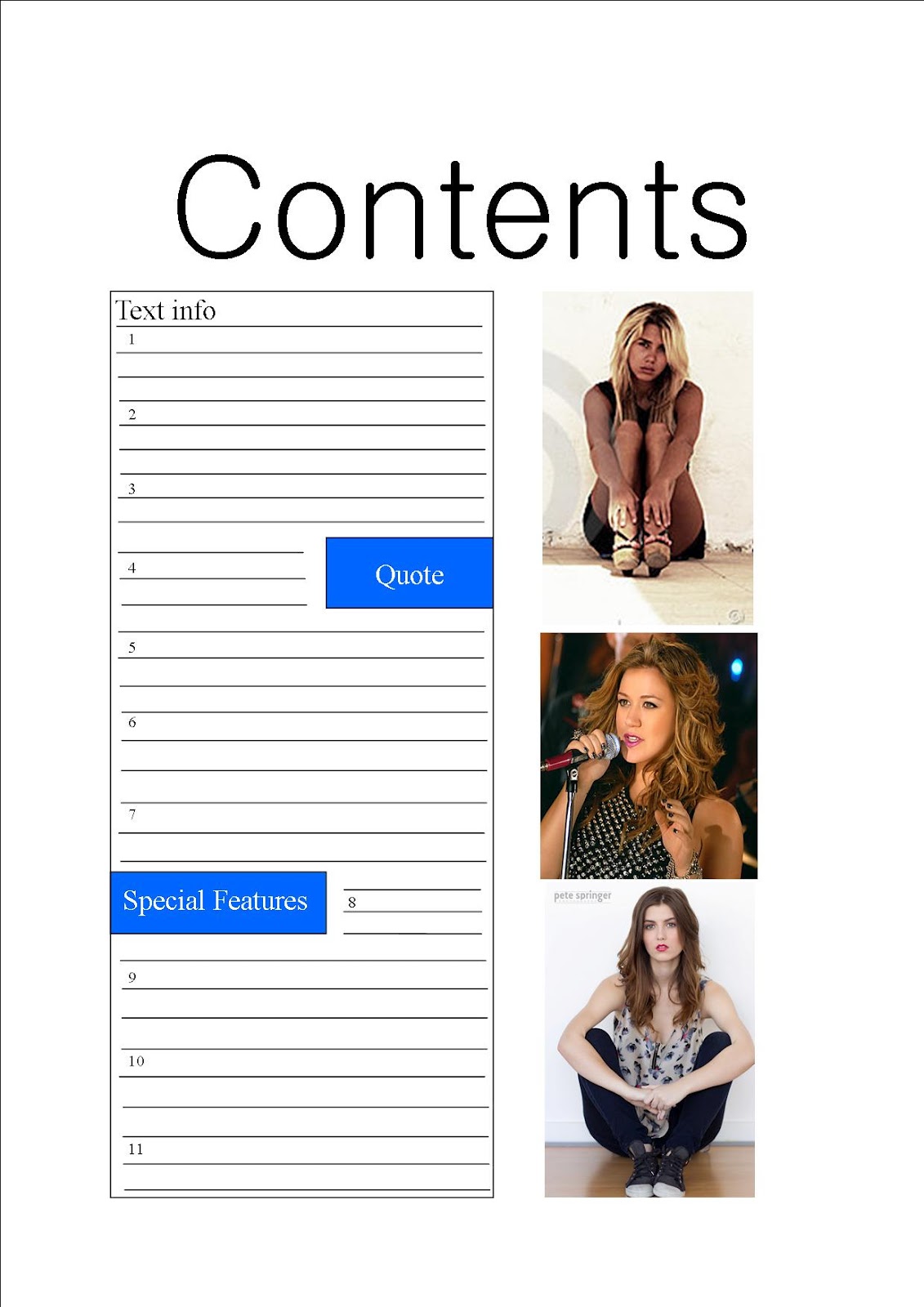
This is a basic computer version design idea of what my contents page for my music magazine will be like. This is my first design idea.This computer version design for my contents page is a very basic idea. It works well in showing the basic idea of the layout of this design idea. However, it is very basic and I don't this that it is effective as it good be. Nevertheless you can see where this design is heading and starts to give you an idea and view of where this design is heading and will turn out.

This is a second basic computer version design idea of what my contents page for my music magazine willl be like. I think that this computer version design for my contents page is a very basic idea. It works well in showing the basic idea of the layout of this design idea. However, it is very basic and I don't this that it is effective as it good be. Nevertheless you can see where this design is heading and starts to give you an idea and view of where this design is heading and will turn out.
The images used for these two design ideas are not the exact photographs that i will be useing for my final contents page.
Basic computer version of front cover


This is a second basic computer version design idea of what my front cover for my music magazine will be like. Again I think that this computer version design for my front cover is a very basic idea. It works well in showing the basic idea of the layout of this design idea. However, it is very basic and I don't this that it is effective as it good be. Nevertheless you can see where this design is heading and starts to give you an idea and view of where this design is heading and will turn out.
The images used for these desing ideas are not the exact photographs that will be used for my final front cover.
Handrawn sketches of double page spread


This is my second hand drawn sketch idea of the layout of my double page spread. Including sketches of photograph ideas to be included in the double page spread of my music magazine. I think that this is again a good sketch idea for my double page spread. I think that it starts to give me a good idea of were the layout and the contents of my front page is heading.
Thursday, 9 February 2012
Hand drawn sketches of contents page

This is my first hand drawn sketch idea of the layout of my front cover. Including sketches of photograph ideas to be included on the front cover of my music magazine. I think that this is a good first sketch idea for my contents page. I think that it starts to give me a good idea of were the layout and the contents of contents page is heading. I think that its good for a quick sketch idea however layout could of possible been thought about better to make it more effective for giving a good strong idea of the outcome of my final finished contents page.
.jpg)
This is my second hand drawn sketch idea of the layout of my contents page. Including sketches of photograph ideas to be included on the contents page of music magazine. I think that this is again a good sketch idea for my contents page. The photographs to be used are different to the prefers which is good in giving a second possible view of how my contents page could turn out. I think that again it starts to give me a good idea of were the layout and the contents of my contents page is heading.
.

This is my third hand drawn sketch idea of what my contents page will possibly be like. Including sketches of photograph ideas to be included on my double page spread of my music magazine. This third idea is different to the previous two as it is over a double page, where as the previous two were only a single page for the contents. This is the idea that I am going to go with because taking up a double page for a contents page will allow me more space for texts and images. Therefore it should not look as crowded as more space will be allowed.
I think that these sketch ideas for my contents page are good in showing three different layouts of how my final finished contents page could turn out. I have kept my sketches basic however I think that they work effectively in showing design ideas.
I think that these sketch ideas for my contents page are good in showing three different layouts of how my final finished contents page could turn out. I have kept my sketches basic however I think that they work effectively in showing design ideas.
Hand drawn sketches of covers


This is a second hand drawn sketch idea of what the layout of my front cover will be like. Including sketches of photographs to be included on my front cover. I think that this is again a good sketch idea for my front cover. The photograph to be used is completely different to the prefers which is good in giving a second possible view of how my front cover could turn out. I think that again it starts to give me a good idea of were the layout and the contents of my front page is heading. I think that its good for a quick sketch idea however layout could be though about more as now looking at it finished looks a bit bare.
Sketches ideas for photographs/coverlines/inside infomation

These are sketches of photograph ideas that i intend to use for my front cover. Above these images are cover line ideas that I may use on my front cover. I think that these sketches are a good sample of different photograph ideas I could use for my front covers. I also think that the cover lines above these are a good samples for ideas to use, as well expanding on. I can now use these sketches and cover lines as a starting board to create my front cover and expand on them to make it successful.

These are sketches of photograph ideas that i intend to use for my contents page. I intend to use 2-4 of these images. Above these images are ideas for what text will be included for my contents page. I think that these sketches are a good sample of different photograph ideas I could use for my contents page. I also think that the text to be included on my contents page above these are a good samples for ideas to use, as well expanding on. I can now use these sketches and text content as a starting board to create my contents page and expand on them to make it successful.

These are sketches of photograph ideas that i intend to use for my double page spread. I will use 2-4 of these images. Above these images are ideas for what my interview will be about and possible headlines for my double page spread. I think that these sketches are a good sample of different photograph ideas I could use for my double page spread. I also think that the headlines and possible story lines above these are a good samples for ideas to use, as well expanding on. I can now use these sketches, story line ideas and possible headlines as a starting board to create my double page spread and expand on them to make it successful.
Wednesday, 8 February 2012
Questionnaire
This is a sample of the first half of my questionnaire complete by a target audience.

This is a sample of the second half of my questionnaire completed by a target audience.

My questionnaire results provided me with another data to create graphs for each question and show clearly what the prefrences of target audience were for a music magazine. From all of this data information and research on my target audience and other music magazines, I now have enough information to start designing and creating my music magazine. I think that my questionnaire has worked well and effective with closed questions as it gets to the point and creates clear and precise graphs for my data. Whereas if I had used opened questions, I would have detailed and even reliable results, however this would be more difficult to create clear graphs.
Tuesday, 7 February 2012
Questionnaire results - Graphs

These are the first 4 graph results form my questionnaire researching my target audience. 'What genre of music do you like?' graph tells me that the top 3 most prefered music genre for my target audience is Rock, Pop, and R'n'B. Therefore, my magazine will be focused towards these three genres of music. From my graph 'Do you prefer a music magazine with a mixed genre?' tells me that I have a choice of whether to have a mixed genre or not as the results are equal for with and without a mixed genre. From my results i can see that the main attraction for the majority of my audience is the band/artist on the front cover, therefore I will be perticularly careful when choosing my band/artsist and the way inwhich they are placed on my front cover as this is going to attract the majority of my audience to my music magazine.

My colour scheme will consist of three main colours and these will be the top three colours that were prefered from my results, these are black, blue and red. This is because from my results I can see that the three most prefered colours by my audience for a music magazine are these three colours and therefore these colours should be the most effective for my magazine where my audience is conserned. My question 'Do you like music festivals, conserts/gigs?' showed that where not everyone aswered this question, a high majority of my sample answered 'yes' to this question and therefore this gives me information on what i can include within my magazine. A coverline on festivals and concerts would therefore possibly attract my audinece to buy my magazine. From my results I can also see that the majority of my audinece would also be interested in a magazine if there was a brand or album review or an interview, therefore this could be another base for a coverline on the front of my music magazine. Again from my results I can see that the majority of my audience woud not be inclinded to buy a music magazine if it came with a competition, although a small amount would be more incline, therefore I may include this if I have time after other part however it is not one of the nessassery things to be included at the majority of my sample said that the would not be more incline.

From these reults I can see that the majority of my audience would be willing to pay £2.50 for a music magazine. Although the second most prefered price is £1, there were more people in total that were willing to be £3 and £3.50. Therefore I think that £2.50 would be a suitable price for my music magazine. These results also show that the most prefered name for my music magazine, out of a range of names, is 'Mixbeat' therefore as this is the majority choice this is the name that I will be going with for the name of my magazine. These graph results show that for my contents page the majority of my sample prefer the text to be to the left side of a contents page. As this is what the majority prefer this where the text for my contents page will be positioned. They also give my information on the prefered amount images placed on the page, therefore my contents page will consist of 2-4 images.

These graphs show more information for my contents page. These 4 graphs show that the majority of my audience prefer the image and text to be inline, however, there is a high percentage, although not as high, do prefer the image and text not to be inline. Nevertheless where i will consider all my results for all my questions, my magazine will be focused on the majority results of ech question. These results also tell me that the majority think that both text and the images on the contents page are equally important and there should be an equal amount of text and images on the contents page. Therefore I will try not to make one stand out more than the other. From my results I can see that the majority prefer a contents page to be ordered by numbers and therefore this is the way inwhich my contents page will be ordered.

These graphs show that the majority prefer the overall layout of the contents page to be neat and organised, therefore this will be the overall layout of my contents page. These graphs also start to give me information for preferences for my double page spread. They show tell me that the majoirty prefer the image for a double page spread to one page for one image, however the majority also prefer there to be more than one image on a double page spread. This idicates to me that they prefer one main image taking up half of the double page spread as well as a smaller image not taking up as much space. The graphs imform me that the majority also prefer the heading of a double page spread to be across the top of both pages, however, there is also a high percentage that prefer the heading to take up a quater of one page. Although I will be go with the majority amount as this is the majority of what my target audience prefer.

These last three graphs give me more information about my double page spread. These show me that the majority prefer a double page spread to be an interview rather than an article. However, a few of my sample did not answered thus question and therefore is not completly reliable, however, the total of the unanswered and article answeres together would still not be more than the majority that prefer an interview. Therefore my double page spread will be an interview. Again like the contents page, the majority prefer there to be an equal amount of images to the amount of text that there is. Therefore again I will try not to make one stand out more than the other. My question 'What colour do you prefer for an article/interview title?' shows that there are three equal answers. These are red, blue and other. However, the other option consisted of 2 purple answers, 2 yellow answers, 1 pink answer and a housestyle answer. Therefore after removing this as one of the majority colours I am left with red and blue. Therefore since one of my earlier asnwers on what colours the prefer to see in a music magazine was black, white and blue, for this answer I will take the answer blue as the majority as this will fir my housesyle colour.
Friday, 3 February 2012
Analysis of a double page spread from a music magazine 'NME'
 This double page spread from 'NME' features an article about a new band called 'The Teenagers'. The image of the new band takes up the whole of the left side of the double page spread and shows them looking very relaxed in their natural enviroment and not posed. There is not focus on one member more than the other which shows that they are all to be seen as equal parts of the band. There is a headline beneath the one of the members. The headline of the article is the largest font of the page. Its written in black serif font in a blue box to draw the readers attention to it. Underneath is the sub-heading of the article, describing what the article is about, with the article underneath this again. This text is much smaller than the heading, as the readers attention should already be drawn to the article by the heading. The sub-heading is again written in a bold serif font, to still make it stand out from the article itself but not as much as the heading of the article. In the middle of the article there is a quote from the interview which is highlighted in a blue box and white serif font to make it stand out and draw the readers attention to it and make them want to read the interview. In the bottom left hand corner there is another blue box which gives you the need to know about the band. The text in this box is written in both black and white, and sans serif and serif font. The name of the band in this box is in serif white text, as the name of the band should be more formal than the rest of the text in the box as it is the name of the band. The 'need to know' written in this box is the largest written in this box in black sans serif font. This is to make what the information in this box clear and stand out to the reader. This is useful to the reader's who are just flicking through the magazine and may want to read the 'need to know' first to get a little understand of the band before reading the whole article and finding out all about them on the other side of the double page spread. Down the side of the double page spread is a sperarate feature to the article. This feature tells the reader about other new bands that they may be interested in. There is a headline and image featuring each new band in this sperate feature. This extra feature is layed out well and keeping with the colour scheme of the rest of the double page spread. Using the colours black, white and blues. A thin strip down the side of the feature separates this feature from the main article keeping the two things sperate, but related by using the same colour scheme. Again the main headline on this feature about other bands is the largest part of the feature, in white sans serif font inorder to draw the readers attention to the feature. The sub-heading is then based in a blue box with white serif font. This fomate is the opposite to the main article. Again this would make the feature stand out seperately to the article. The name of each new band is slightly smaller than the heading but larger than the information about the each new band which is underneath each band name. The colour scheme for this page is kept consistent keeping to a house style, with only using black, white and blue.
Analysis of a double page spread of a music magazine 'NME'
 This double page spread from 'NME' features the main article name, which is also a pull
quote ‘People think I’m an Attention Seeker, but I’m just honest’, it is an
interview with the singer Lily Allen, and features one picture of Lily. This image takes up most of the pages making her the most noticeable and eye-catching piece on the page. By using a popular face, Lily Allen, many potential readers could be interest in this magazine even if the music genre this magazine covers in not the type of music they are interested in, as many people will recognise Lily Allen and therefore be interested in the article written about and published about her within this magazine, as she has caused very controversial stories within the media. Her casual clothes and dark eye shadow reflects her personality and the title of the article. Her stance is also very casual and forward, aslo linking in with the title of the article. Her stance could suggest that she doesn't care about acquisitions people are making about her. The picture of Lily Allen covers the whole of the right hand side of the page, leaving the left page for all of the text. The picture of Lily shows her standing confidently with her hands on her hips, which works with the article itself that is showing her as outspoken and confident in herself. The style of the title of the article is very intriguing. The font is sans serif and made to look like
cut-outs from newspapers, it’s black and white in colour. Each letter is in the style of a letter from a newspaper, but each letter is a different size, making it different and quirky. It also reflects the rebellious attitude that the magazine often portrays in other articles. The title of the article takes up more room than the image and the article itself. This shows that the magazine is trying to grab the attention of a reader that is maybe just flicking through the magazine. The font in the article itself is all sans
serif and black in colour except Lily’s name at the top which is in bold red and
also looks as though it has been cut from newspapers. The fact that the article
title is a pull-quote helps the audience to see what the basis of the interview
is about and whether they would enjoy it or not. The colour scheme on this
spread is very simple and clean with it being black and white aside from Lily
herself who is dressed in red which makes her really stand out and eye-catching.
The colours on this double page spread is used to good effect. Her red shirt stands out amongst the plain white and black that is used on the rest of the double page spread. This helps to attract the readers attention and invite them to read the article.
This double page spread from 'NME' features the main article name, which is also a pull
quote ‘People think I’m an Attention Seeker, but I’m just honest’, it is an
interview with the singer Lily Allen, and features one picture of Lily. This image takes up most of the pages making her the most noticeable and eye-catching piece on the page. By using a popular face, Lily Allen, many potential readers could be interest in this magazine even if the music genre this magazine covers in not the type of music they are interested in, as many people will recognise Lily Allen and therefore be interested in the article written about and published about her within this magazine, as she has caused very controversial stories within the media. Her casual clothes and dark eye shadow reflects her personality and the title of the article. Her stance is also very casual and forward, aslo linking in with the title of the article. Her stance could suggest that she doesn't care about acquisitions people are making about her. The picture of Lily Allen covers the whole of the right hand side of the page, leaving the left page for all of the text. The picture of Lily shows her standing confidently with her hands on her hips, which works with the article itself that is showing her as outspoken and confident in herself. The style of the title of the article is very intriguing. The font is sans serif and made to look like
cut-outs from newspapers, it’s black and white in colour. Each letter is in the style of a letter from a newspaper, but each letter is a different size, making it different and quirky. It also reflects the rebellious attitude that the magazine often portrays in other articles. The title of the article takes up more room than the image and the article itself. This shows that the magazine is trying to grab the attention of a reader that is maybe just flicking through the magazine. The font in the article itself is all sans
serif and black in colour except Lily’s name at the top which is in bold red and
also looks as though it has been cut from newspapers. The fact that the article
title is a pull-quote helps the audience to see what the basis of the interview
is about and whether they would enjoy it or not. The colour scheme on this
spread is very simple and clean with it being black and white aside from Lily
herself who is dressed in red which makes her really stand out and eye-catching.
The colours on this double page spread is used to good effect. Her red shirt stands out amongst the plain white and black that is used on the rest of the double page spread. This helps to attract the readers attention and invite them to read the article.Analysis of a contents page of a music magazine 'Q'
 This layout of the edition of 'Qs' contents page is basic and neat. This contents page fits the consistent layout of 'Q' magazine, with the fonts and red black and white colour scheme, this contents page is clear and concise. It follows conventions of most other magazine contents pages. On the left hand side, the subheading ‘features’ is written with page title listings, by putting the numbers and articles on the left hand side of the page. Nothing on the page really overlaps, its all very tidy. This makes it easier for the reader to pages and articles that they are interested in. The title 'contents' is written clearly at the top, with 'Q' logo next to it. Like the front cover of Q' magazines, the main image for the contents page take up the majority of the page. Although there are not lots of images on this contents page, like other magazine content pages, this content page just has one large image of the band 'The Courteeners' who are featured in this particular edition of the magazine. This gives the audience an idication to what the main story line within the magazine is going to be about. Representing the style of the magazine, this all male band are dressed in skinny jeans and indie styled shirts, one with sunglasses, to refelect the indie/rock them of 'Q' magazine as a whole. There is a subheading 'every month' showing what pages are included in each edition of the magazine. In the featured section 'OASIS SPECIAL!' is written, standing out in a different font and in gold, to attract and excite fans. The text that reads 'features' and 'every month' are in white writing and highlighted in red. This makes the different sections of the information on the page stand out. This also sticks to the brand identity of 'Q' magazine by keeping to the same font and style. Under the main image, a box with the 'Q REVIEW' is included, with a smaller image of another person, titled 'the world's biggest and best music guid' this box has page listings of different reviews.At the bottom of the page there is information about corsswords answers and subscription payments. This part of the contents page is sectioned off compared to the music section above. The colour scheme is very plain, the background is a light shade of grey. I think this contents page is good, as it has one focus image showing who is featured in this edition, with the normal page listings around it, organised into categorised sections. This page has a strict colour theme of red, white and black, as does the other pages in Q, so it fits in with the magazine.
Analysis of a contents page of a music magazine 'Spin'
 This contents page is from Spin magazine and is a simple example of a music magazine contents page. Instead of having many pictures,
there is one picture and this serves as the complete focus for this
page. The image for this contents page is of a famous female artists, Duffy, who reflects the type of music that this magazine looks at and reflects the type of audience that Spin magazine is targeted at. The way inwhich Duffy is
holding the ukelele suggests that she is poised to smash it. Again this reflects
the type of music that this magazine portrays. It is a rock/alternative
magazine, so the magazine is showing an action that people think rock stars should be
doing. They have done this by looking at stereotypical views that the audience has of this music genre and using an image that will attract the audience attention to the magazine. The amount of lighting focused on Duffy is more than the amount of lighting focused else where. The image shows a shaddow behind Duffy which helps to bring the image more forward. This gives more of a 3D feel to the image, making it stand out and entice the targeted audience in. With light focused particularly on her face, this gives the impression that she is a rock/alternative atists and this is the type of music genre within the magazine. By bringing the image more foward and centred than the text this suggests to the audience that she is of importance within the magazine as is most likely the main feature of this issue of Spin magazine. The writing to the left side of the page is kept simple and basic by doing this it
means that the reader is overwhelmed by lots of colours and images. The text for the contents The logo for the magazine is in
the top left-hand corner is just in the same place that it is on the front
cover. This gives a sense of cohesion for the magazine, that everything is
together. And the red of the logo contrast with the quite muted colours of the
image. This makes it stand out and the name of the magazine gets reinforced in
their head, they are more likely to remember it. In the top right-hand corner,
there is a quote from Duffy. This gives readers a little insight into her and
the article. But because its so short they don't get to know very much, this
will make people want to read the article to know what she's saying and what
context it is in. In the actual contents, which
are placed next to the singer, are very simple. There is no background, but the
names of the band are in bold, this means that it is easy to see which bands are
in the magazine.
This contents page is from Spin magazine and is a simple example of a music magazine contents page. Instead of having many pictures,
there is one picture and this serves as the complete focus for this
page. The image for this contents page is of a famous female artists, Duffy, who reflects the type of music that this magazine looks at and reflects the type of audience that Spin magazine is targeted at. The way inwhich Duffy is
holding the ukelele suggests that she is poised to smash it. Again this reflects
the type of music that this magazine portrays. It is a rock/alternative
magazine, so the magazine is showing an action that people think rock stars should be
doing. They have done this by looking at stereotypical views that the audience has of this music genre and using an image that will attract the audience attention to the magazine. The amount of lighting focused on Duffy is more than the amount of lighting focused else where. The image shows a shaddow behind Duffy which helps to bring the image more forward. This gives more of a 3D feel to the image, making it stand out and entice the targeted audience in. With light focused particularly on her face, this gives the impression that she is a rock/alternative atists and this is the type of music genre within the magazine. By bringing the image more foward and centred than the text this suggests to the audience that she is of importance within the magazine as is most likely the main feature of this issue of Spin magazine. The writing to the left side of the page is kept simple and basic by doing this it
means that the reader is overwhelmed by lots of colours and images. The text for the contents The logo for the magazine is in
the top left-hand corner is just in the same place that it is on the front
cover. This gives a sense of cohesion for the magazine, that everything is
together. And the red of the logo contrast with the quite muted colours of the
image. This makes it stand out and the name of the magazine gets reinforced in
their head, they are more likely to remember it. In the top right-hand corner,
there is a quote from Duffy. This gives readers a little insight into her and
the article. But because its so short they don't get to know very much, this
will make people want to read the article to know what she's saying and what
context it is in. In the actual contents, which
are placed next to the singer, are very simple. There is no background, but the
names of the band are in bold, this means that it is easy to see which bands are
in the magazine.Analysis of a contents page of a muic magazine 'Vibe'
 This contents page has a calm feel to it. The masthead for the content page, from 'Vibe' magazine, is in a bold drop capital white sans serif white font, this contrasts with the dark background. The title of the page is something that captures the readers attention straight away. This is beacuse of the large white lettering against the balck background. The word 'cometents' is split into three lies. The abstract way inwhich it is written also draws attention towards it. This style of the headline is carried through all the 'Vibe' magazine issues contents page and therefore fits in with the magazines house style. This creates a whole new brand identity and makes this a feature of Vibe magazine. The way in which it is postioned also makes it look more modern and unique. The main text on the page is written on the right side of the page, this position of the text works well as the reader is automatically drawn towards the image. So positioning the text next to the image makes it more noticeable. This contents page splits the different stories into two different categories, features' and 'fashion'. The text that reads 'features' and 'fashion' is in a serif style. The category titles are bigger and in a more interesting font than the features of the catergoies underneath each title. The page number and story title are on the same line but are slightly different colours, so that it is easy to see that they are separate things. The page numbers are in chronological order. Its split into two sections as it splits the magazine into the two main sections, which then makes it easier for the readers. This may be done becuase the readers may only be interested in the features or fashion section of the magazine. Underneath these titles there are page numbers and small features with short cover lines explaining what the feature is about. The background sticks to plain and basic colours so that that the main image of a female model and the text stands out as the main part of the contents page. The white outline of the 'V' which is on the background of this contents page links to the main image as the 'V' connects to the models legs as they are in the shape of a 'V'. The model is wearing heels in this image which could be connected to the fashion side to this magazine. The model is the main image of this contents page and is wearing sexy clothes and is place in a sexy pose, both in her body language and facial expression. The fact the model is wearing both silver and gold is good for reflecting that both the model and the magazine is of an upper class. The main image works well for the contents page for 'Vibe's' target audience of younger people. The attractive pose from the female model can catch the attention of both female and male readers. The whole page lacks in colour, however I think this makes it look more stylish and proffesional. Adding more colour to this contents page could potentionally ruin this suitable outcome.
Analysis of a front cover of a music magazine 'Q'
 The masthead on Q magazine has always been the same and is well known, for its white font on a red background. The red emphasises the font and makes it stand out more to the audience. The colour red is symbolic of many things, love, passion, danger, blood, its a very widely used colour as it can mean many things. The white text on top of the red background causes each to stand out and attract attention from the target audience. The header is only a small white blocked out part of the main image and is advertising the ‘50 best albums’ this uses two types of colours, orange and black, both of which contrast each other and make each other stand out.
The black part of this header is written in a serif font whereas the orange part of this header is written in a sans serif font, this helps to draw the potential readers attention to the magazine. The colour scheme is simple with red/orange, black and white being the main colours other than the one line in light pink, which is the main cover line, making it stand out more than the others. The contrast between the
red and black and white and black is clever as the words stand out more and more against the main image. The one line and only part of pink on this front cover (going against the colour scheme) helps to draw the attention of potential readers, as it helps to make the front cover of this magazine stand out against others. The main image is of Kings of Leon themselves and instead of a typical band pose the image is a crazy glass breaking stance of them. This image of the band ‘breaking through’ links to the main cover line in pink. This is a clever link as it entices the reader making them more interested. There is a small amount of font on this front cover as the main image is the main part. There is a small list of some of the artists that feature in the magazine in a small and white font. The other cover lines are in medium font and the main article ‘Kings of Leon’ in the largest font. There are not as many cover lines featured on this particular front cover as the main story is the main attraction, there is a small list of featured artists in small white font and a medium font size cover line ‘play time for The Killers’ visible with the main cover line being ‘Kings of Leon’ in the largest and most visible font making the magazine appeal largely to King of Leon fans. The text is continuous throughout this front cover with being a sans serif font, which links in with the cover image as the image is informal, with the exception of the text that reads 'the killers' which is wrote in a serif font.
The masthead on Q magazine has always been the same and is well known, for its white font on a red background. The red emphasises the font and makes it stand out more to the audience. The colour red is symbolic of many things, love, passion, danger, blood, its a very widely used colour as it can mean many things. The white text on top of the red background causes each to stand out and attract attention from the target audience. The header is only a small white blocked out part of the main image and is advertising the ‘50 best albums’ this uses two types of colours, orange and black, both of which contrast each other and make each other stand out.
The black part of this header is written in a serif font whereas the orange part of this header is written in a sans serif font, this helps to draw the potential readers attention to the magazine. The colour scheme is simple with red/orange, black and white being the main colours other than the one line in light pink, which is the main cover line, making it stand out more than the others. The contrast between the
red and black and white and black is clever as the words stand out more and more against the main image. The one line and only part of pink on this front cover (going against the colour scheme) helps to draw the attention of potential readers, as it helps to make the front cover of this magazine stand out against others. The main image is of Kings of Leon themselves and instead of a typical band pose the image is a crazy glass breaking stance of them. This image of the band ‘breaking through’ links to the main cover line in pink. This is a clever link as it entices the reader making them more interested. There is a small amount of font on this front cover as the main image is the main part. There is a small list of some of the artists that feature in the magazine in a small and white font. The other cover lines are in medium font and the main article ‘Kings of Leon’ in the largest font. There are not as many cover lines featured on this particular front cover as the main story is the main attraction, there is a small list of featured artists in small white font and a medium font size cover line ‘play time for The Killers’ visible with the main cover line being ‘Kings of Leon’ in the largest and most visible font making the magazine appeal largely to King of Leon fans. The text is continuous throughout this front cover with being a sans serif font, which links in with the cover image as the image is informal, with the exception of the text that reads 'the killers' which is wrote in a serif font.Analysis of a front cover of a music magazine 'Rolling Stone'
 The masthead ‘rolling stones’ is hidden by pink who is the main image on the front cover, this shows that they are confident that the fact that Pink is on the cover the magazine will sell more than it would just because it’s ‘Rolling Stones’. It is a traditional font in a red block effect with the grey 3D effect outlining giving the magazine depth and a 2 dimensional feel. The main image and only image is off pink who is a female pop/rock star who is famous for her music and her grungy attitude she is a typical artist that readers of this magazine are interested in. Her stance is in some ways provocative as she is pulling down her jacket she also has a rebellious look on her face which represents her personality. She is dressed in black and the background is black meaning her face mainly stands out with her short choppy hair. The colour scheme is mainly red, black, grey and white which are effectively dull colours except the red which stands out and the white that contrasts against the black background. The clothing Pink is wearing also ties in with the colour scheme as she is also wearing black leather and a white and black neck scarf with tiny bits of red in it. The only exception on the cover is the yellow box on the right side which contains a ‘special report’ with the yellow trying to highlight the fact the story isn’t just like the rest it’s ‘special’. Overall the colour scheme all ties in together and works well together. The header is simple and its only text across the top of the image advertising the type of artists you would find in the magazine it's in a simple white medium size font. The text is a sans serif as the magazine cover is an informal cover, therefore the text links in with the theme of the front cover aswell as the target audience that this magazine is aimed at. The cover lines are in a grey medium size font and only take up a small amount on the page in the bottom left hand side and the only other cover lines being the main one which is the story of Pink ‘the dark side of pink’. This text uses two different fonts and sizes. The 'the and of' with this text is slanted and is a serif font as well as being smaller than the rest of the cover line. The rest of this cover line is larger and wrote in sans serif up straight. This mixture of font in the one cover line has an effect on the audience and they way they read it. As this is the main cover line it has to stand out the most and Rolling Stones magazine does this ny using the both sans serif and serif as well as different sizes with this cover line. A quote from the interview is placed underneath this cover line, in smaller font than the main article font size. The text for the quotation is in a sans serif font, which again links with the informal theme on the front cover.
Anaylsis of a front cover of a music magazine 'Q'
 The masthead on Q magazine has always been the same and is well known, fot its white font on a red background. The red emphasises the font and makes it stand out more to the audience. The colour red is symbolic of many things, love, passion, danger, blood, its a very widely used colour as it can mean many things. There is a colour scheme throughout the front cover of the magazine, this consists of red, grey, balck and white. These colours are very basic and bold, there are no flashy colours which relates to the audience. This main house style is carried throughout this front cover even though there are some differences. The elements that stays the same throughout is the font and the colour of the font. The font is a sans serif font as the text is informal. Below the Q logo is small white text which shows which arists have been interviewed for the magazine, this text is very basic and shows a maturity to the magazine, even though the text is sans serif. The text itself is similiar to the other text used on the front cover. In the top right hand corner there is text, in the same font, to say which other aritists are mentioned inside the magazine wrote in red, with where they are wrote in white underneath. Using these two colours together for this piece of text makes the font stand out as it is the same colours used together for the logo. Below this is large bold red writing of the name of the artist being featured, this is the main title for this cover of Q. This main title splashes across the main cover shot. With the main title being red it links to the main masthead of the magazine which then acts as a frame around the main imgae. This also keeps the amount of colours within the cover limited which shows the magazine is professional and not a joke. The cover shoot is slightly covering the masthead. I believe this shows the status of the person on the cover. The main cover shoot is a close up. The shot in the front cover is a well known celebrity, Madonna, who is extremely well known for her music carrier which would link very well the theme and purpose if the magazine. In the shot Madonna is wearing what looks luke a boxing robe which could suggest that she is up for a fight and you have to fight to succeed in this world. This front cover has another image on it, spread across the bottom of the cover, although this image is much smaller in size, showing that it has less importance to the magazine than the main cover shot which covers a large percentage of the front cover.
Preliminary task - contents page

This is my contents page for a student magazine for my preliminary task.
Preliminary task - front cover

This is my front cover for a student magazine for my preliminary task.
Subscribe to:
Posts (Atom)