 This is the final finished photograph that I am using on my double page spread. I have edited this image by adjusting the brightness and contrast to make it as successful as possible on my article. I have also cropped out bits of background that are not necassery in order to fill up the space as much as I can with the main image its self without loosing any important aspects of the image itself. I think that it is a catch image that will catch my audience eye and draw their attention into the article. The image suggests that the article is about a fun bubbly artists, which I think is also represented within my article and therefore the two represent each other well and go hand in hand with one another.
Wednesday, 21 March 2012
Photographs for Double Page Spread
This is the final finished photograph that I am using on my double page spread. I have edited this image by adjusting the brightness and contrast to make it as successful as possible on my article. I have also cropped out bits of background that are not necassery in order to fill up the space as much as I can with the main image its self without loosing any important aspects of the image itself. I think that it is a catch image that will catch my audience eye and draw their attention into the article. The image suggests that the article is about a fun bubbly artists, which I think is also represented within my article and therefore the two represent each other well and go hand in hand with one another.

Photographs for Contents Page
 This is an photograph of an extreme close up that I have choosing to use for one of my smaller images that fill feature on my contents page. I think that this photograph will be a successful image on my contents page. This is because I think the style of the image represents my music magazine well. The colours in the photograph are kept basic.
This is the main final finished photograph of an image that I am using on my contents page. For this image I have used a close up shot. I have edited this image by adjusting the brightness and contrast to make it as successful as possible on my contents page. I have also cropped out bits that are not necassery in order to fill up the space as much as I can with the main image its self without loosing any important aspects of the image itself. I think that it is a catch image that will catch my audience eye and draw their attention into wanting to know what is featured in the magazine.
 This is an photograph of an extreme close up that I have choosing to use for one of my smaller images that fill feature on my contents page. I think that this photograph will be a successful image on my contents page. This is because I think the style of the image represents my music magazine well. The colours in the photograph are kept basic, however the colour of the hair in this image works really well will the colour on the guitar of the previous image. Therefore I will put these two images close together so that the colours can run nicely from one to the other. I think that these are two images that will go hand in hand with each other very nicely. they keep with the house style of my music magazine.
This is the main final finished photograph of an image that I am using on my contents page. For this image I have used an extreme close up shot. I have edited this image by adjusting the brightness and contrast to make it as successful as possible on my contents page. I have also cropped out bits of background that are not necassery in order to fill up the space as much as I can with the main image its self without loosing any important aspects of the image itself. I think that it is a catch image that will catch my audience eye and draw their attention into wanting to know what is featured in the magazine.
 I have used a mid shot for this image. I think that this photograph is the one that will be the most successful as the main and largest image on my contents page. This is because I think the style of the image represents my music magazine well. The colours in the photograph are kept basic, however they keep with the house style of my music magazine.
  This is the main final finished photograph of the main image that I am using on my contents page. It is a mid shot of the artist that will be featured in my article, leaning against a wall. I have edited this image by adjusting the brightness and contrast to make it as successful as possible on my contents page. I have also cropped out bits of background that are not necassery in order to fill up the space as much as I can with the main image its self without loosing any important aspects of the image itself. I think that it is a catch image that will catch my audience eye and draw their attention into wanting to know what is featured in the magazine.
Photographs for Front Cover
 This was one of the first photographs that I took myself for my front cover. It is an unedited version of the image. I thought that this image could work on my front cover, however after trying it out I decided that it would not make my front cover as successful as I think I could make it. So, after trying this image out and choosing against it I took some more photographs and got an image that would work excellently as the main image for my front cover. Although it is not a photograph of the main person featured in my music magazine, that being the person my article is about. Therefore too come around this problem I will change the main cover line on my front cover to be about the person I am using on my front cover.
 After choosing against using my original photographs for my front cover, I took more photographs a found that this image (to the right) is the one I will use for my front cover. This is because I think the style of the image represents my music magazine well. The colours in the photograph are kept basic, however they keep with the house style of my music magazine. This is not the person that I have used for my double page spread, however, I did not feel that it was necassary to have the same person on my front cover as I have written about for my article. This is because from my research I found that there was a number of articles and interviews in music magazine about a variety of different artists and bands, who can not all be on the front cover. Therefore because having a different artist on my front cover to the artist I have interviewed for my article is not a problem. As this suggests that there are more articles in the music magazine and shows that this is thought about. The artist for my article will still be mentioned on my front cover as well as this new artits that I have introduced to my magazine.
 This is the final finished photograph that I am using on my front cover. I have edited this image by adjusting the brightness and contrast to make it as successful as possible on my front cover. I have also cropped a tiny bit at the bottom to make it fit onto my front cover nicely without loosing any important aspects of the image itself. Its a catch image that will catch my audience eye and draw their attention into it.
Friday, 10 February 2012
Screanshot of email sent for photo shoot

Basic computer version of double page spread


This images used in for these designs are not the exact photographs that will be used for my final double page spread, as these are not my own photographs.
Basic computer version of contents page
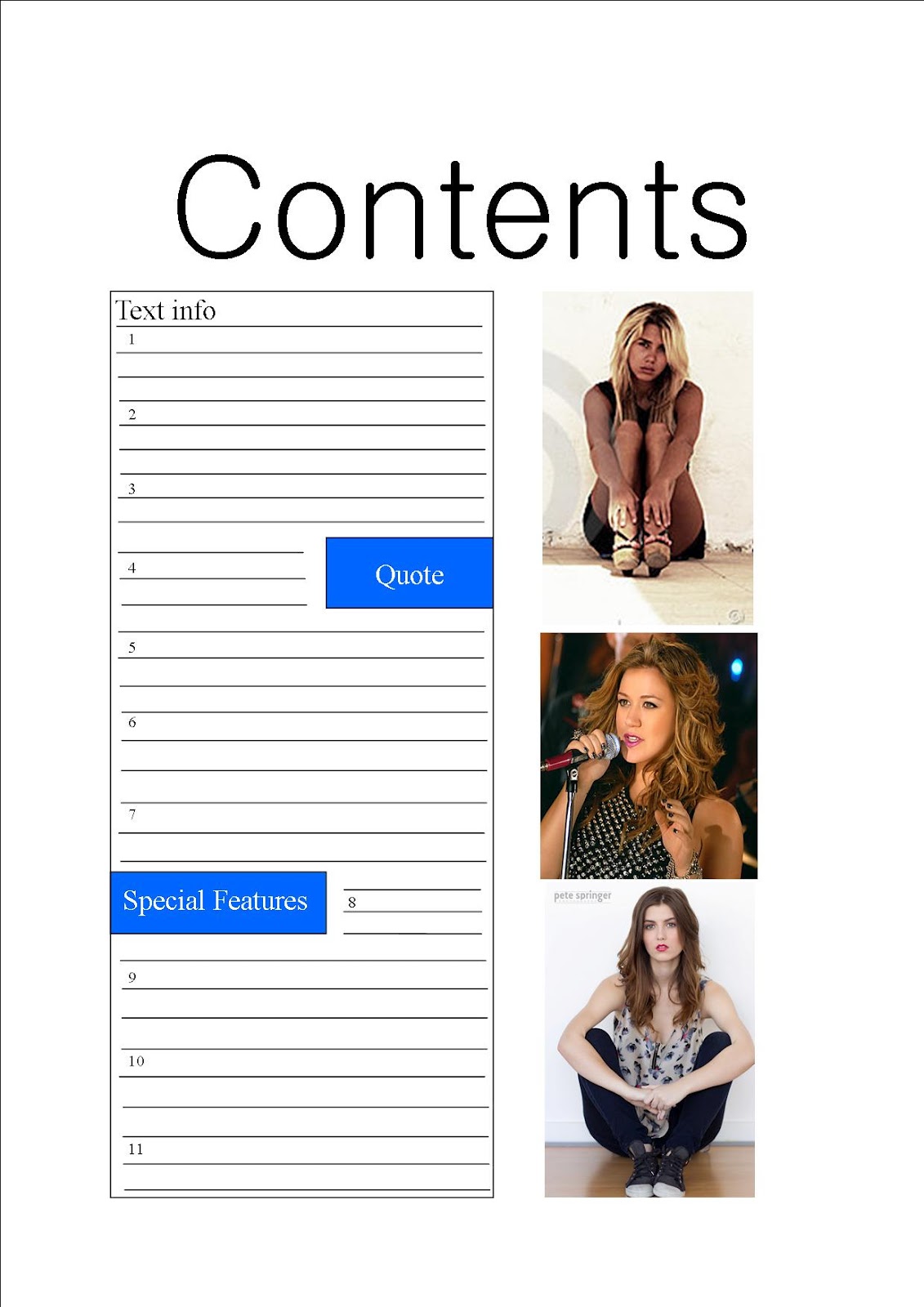
This is a basic computer version design idea of what my contents page for my music magazine will be like. This is my first design idea.This computer version design for my contents page is a very basic idea. It works well in showing the basic idea of the layout of this design idea. However, it is very basic and I don't this that it is effective as it good be. Nevertheless you can see where this design is heading and starts to give you an idea and view of where this design is heading and will turn out.

This is a second basic computer version design idea of what my contents page for my music magazine willl be like. I think that this computer version design for my contents page is a very basic idea. It works well in showing the basic idea of the layout of this design idea. However, it is very basic and I don't this that it is effective as it good be. Nevertheless you can see where this design is heading and starts to give you an idea and view of where this design is heading and will turn out.
The images used for these two design ideas are not the exact photographs that i will be useing for my final contents page.
Basic computer version of front cover


This is a second basic computer version design idea of what my front cover for my music magazine will be like. Again I think that this computer version design for my front cover is a very basic idea. It works well in showing the basic idea of the layout of this design idea. However, it is very basic and I don't this that it is effective as it good be. Nevertheless you can see where this design is heading and starts to give you an idea and view of where this design is heading and will turn out.
The images used for these desing ideas are not the exact photographs that will be used for my final front cover.
Subscribe to:
Posts (Atom)